In April, ASLA's The Field published a piece looking at the latest examples of New Urbanism and calling for landscape architecture to assert itself in more meaningful ways in these projects. The author, Clemson Professor Thomas Schurch, talks about the role for landscape architecture on Professional Community Assistance Teams, which seems even more timely today.
As he points out, in between some compelling project photos and plans, the relationship between LA and our allied professions is incredibly important. And in a post-pandemic, post-protest, post-recession world, inclusive teamwork is going to be critically important.
10 June 2020


06 June 2020
Musical outlets
We each have our own ways of getting through this. I have been retreating to the music of Muzio Clementi, Johann Nepomuk Hummel, Jan Ladislav Dussek and Joseph Wölfl. This year is the 250th anniversary of Beethoven's birth, and we would have seen s series of concerts around the world to celebrate. But a few weeks ago the NY Times published a story on the French pianist Bavouzet, who was instead revisiting the work of Beethoven's contemporaries and colleagues. Since then, I have been enjoying the catalog of their work. It isn't the only thing I am listening to or watching, but it has been a nice backdrop to sheltering in place.
05 June 2020
Access to care
Who has access to care? It has become a particularly timely question. Our recent team recently asked that question for the nation of Colombia. But a new set of maps pose it for US cities during the pandemic.
27 May 2020
Mapping out testing sites
According to NJ.com, today's list of COVID-19 testing sites for New Jersey has 113 locations. They are not all open to the public. A couple are not very specific about the location. Some appear to be small and limited in ability while others are large and high volume.
The state relies on alternatives and private companies as part of that equation. Of the 113 listed testing sites, 58 are one of these retail locations:
UPDATE: CVS has announced that they are expanding to 45 drive-thru sites:
https://www.nj.com/news/2020/05/cvs-expands-drive-thru-coronavirus-testing-to-45-more-nj-locations.html (5/28)
The map below shows all 113 testing sites as points. The locations are generally more concentrated in urban areas than rural. The redlines are Voronoi polygons which calculate the areas closest to each site without regard to population or capability.

Looking closer, the list shows that the state's 4 largest cities only have a seven of the sites:
Newark: 3 sites 7.059 cases
Jersey City: 3 sites 6,709 cases
Paterson: 0 sites 7,007 cases
Elizabeth: 1 sites 5339 cases
That means those four municipalities represent about 9% of the state's residents and nearly 17% of the cases in New Jersey but have about 6% of the testing sites. The disparity is striking. Some of these are counting on larger sites in adjacent towns, but those without cars might find this challenging. With limited information on capability, it is hard for us to know which sites contribute the most to New Jersey's burden. The map below shows distances from the sites (as the crow flies).

Even with a car, some areas are pretty distant. The map below shows areas within 20 minutes a of all sites, in yellow. Many of the underserved areas in North Jersey are from from other services too, so maybe they won't be surprised. But notice how much of the Jersey Shore is left without easy access - all of LBI is well over 20 minutes. The far ends of the island are over a 90 minute round trip to and from a testing center.

As the beaches reopen, New Jersey is going to need more testing near those active areas. Both for beachgoers and the many workers in LBI businesses.
I made these today with publicly available data and limited time while moving between other projects. But with more time and better data there is plenty more worth asking. What does the map look like if we remove few of the most selective sites (e.g., front line workers only)? Are the urban clusters of testing sites proportional to the populations in those areas? Do site capabilities change that any? How far do people without cars have to travel to access a walk-up or walk-in site? How does access compare with social vulnerability?
The state relies on alternatives and private companies as part of that equation. Of the 113 listed testing sites, 58 are one of these retail locations:
| Rite Aid drive-thru | 13 |
| CVS Pharmacy | 11 |
| MedExpress Urgent Care | 7 |
| MedExpress Urgent Care | 7 |
| Walmart | 6 |
| AFC Urgent Care | 5 |
| Immediate Care | 4 |
| PM Pediatrics | 3 |
| Patient First | 2 |
UPDATE: CVS has announced that they are expanding to 45 drive-thru sites:
https://www.nj.com/news/2020/05/cvs-expands-drive-thru-coronavirus-testing-to-45-more-nj-locations.html (5/28)
The map below shows all 113 testing sites as points. The locations are generally more concentrated in urban areas than rural. The redlines are Voronoi polygons which calculate the areas closest to each site without regard to population or capability.

Looking closer, the list shows that the state's 4 largest cities only have a seven of the sites:
Newark: 3 sites 7.059 cases
Jersey City: 3 sites 6,709 cases
Paterson: 0 sites 7,007 cases
Elizabeth: 1 sites 5339 cases
 | |

Even with a car, some areas are pretty distant. The map below shows areas within 20 minutes a of all sites, in yellow. Many of the underserved areas in North Jersey are from from other services too, so maybe they won't be surprised. But notice how much of the Jersey Shore is left without easy access - all of LBI is well over 20 minutes. The far ends of the island are over a 90 minute round trip to and from a testing center.

I made these today with publicly available data and limited time while moving between other projects. But with more time and better data there is plenty more worth asking. What does the map look like if we remove few of the most selective sites (e.g., front line workers only)? Are the urban clusters of testing sites proportional to the populations in those areas? Do site capabilities change that any? How far do people without cars have to travel to access a walk-up or walk-in site? How does access compare with social vulnerability?
26 May 2020
Remembering Candace McKee Ashmun
One of New Jersey's most important voices for preservation has passed away. Candace McKee Ashmun, whose environmental leadership included service on the Pinelands Commission, ANJEC, the Great Swamp Advisory Committee, the Coalition for Affordable Housing and the Environment, and the NJ State Planning Commission, was 96 years old.
Sometimes called the Godmother of the NJ Pines, Ashmun's work as a founding member of the Pinelands Commission is permanently memorialized with the 4,000 acre NJCF Candace McKee Ashmun Preserve. But her impact was felt statewide.
I was struck by the way that all factions of the New Jersey environmental community respected her. The Burlington County Times quoted Michelle Byers, “Within an environmental community that doesn’t always get along everyone respected Candy. She helped bring people together.”
Sometimes called the Godmother of the NJ Pines, Ashmun's work as a founding member of the Pinelands Commission is permanently memorialized with the 4,000 acre NJCF Candace McKee Ashmun Preserve. But her impact was felt statewide.
I was struck by the way that all factions of the New Jersey environmental community respected her. The Burlington County Times quoted Michelle Byers, “Within an environmental community that doesn’t always get along everyone respected Candy. She helped bring people together.”
19 May 2020
Wendell Berry
“If you don't know where you're from, you'll have a hard time saying where you're going.”
― Wendell Berry
Local rates of reported cases

The latest municipal map from the GeoHealth Lab shows recent activity down in Gloucester and Camden. But definitely keep watching AC as well. The earlier caveats still apply.
Fun with GIScience
The United States of Voronoi.
(If you can ever stop looking at that map, click on the link to his larger collection of maps.)
(If you can ever stop looking at that map, click on the link to his larger collection of maps.)
18 May 2020
Step 1: Rethink your resume
As things reopen, employers are going to trying emerge from this storm with exceptional people. How are they going to know that you could be one of them?
The first place to tell them about it is a better resume. Harvard Business Review recommends a quick tune up to make sure it is accomplishing what you need.
When the resume gets transformed from an obligatory tool, to a rich opportunity to reach someone who is hiring, the conversation might begin.
When the resume gets transformed from an obligatory tool, to a rich opportunity to reach someone who is hiring, the conversation might begin.
14 May 2020
COVID-19 in NJ towns
New Jersey has 565 municipalities. Based on the reports I am seeing, there only 10 that still do not appear to be reporting a single case of coronavirus, yet. Altogether these 10 communities represent only about 3,000 people. Three of them, Pine Valley, Tavistock, and Walpack, each have fewer than 20 residents each.
Pine Valley Borough CAMDEN
Tavistock Borough CAMDEN
Cape May Point Borough CAPE MAY
Stone Harbor Borough CAPE MAY
Shiloh Borough CUMBERLAND
Stockton Borough HUNTERDON
Harvey Cedars Borough OCEAN
Mantoloking Borough OCEAN
Elsinboro Township SALEM
Walpack Township SUSSEX
By April 7th the state had broken 500 municipalities reporting at least one case.
On April 15th we had around 541 municipalities with cases.
On April 27th we had 550.
On May 10th Washington Township, Burlington County, reported a case leaving us with just 10 towns without reported cases.
07 May 2020
Getting better
The map of the changes in infection rates is definitely going in the right direction. When it finishes up, you will see blue flecks in Bergen County. That area which was an epicenter is now seeing declines in numbers.

Don't get too comfy, we still have a long ways to go. According to the New Jersey data dashboard, the Garden State still has over 131,000 cases. Based on the JHU COVID Dashboard, there are only about 8 countries (including the US) that have more cases.
This map is part of the ongoing effort at the GeoHealth Lab @ CRSSA to explore alternative ways to see and track patterns of the COVID spread across New Jersey.

Don't get too comfy, we still have a long ways to go. According to the New Jersey data dashboard, the Garden State still has over 131,000 cases. Based on the JHU COVID Dashboard, there are only about 8 countries (including the US) that have more cases.
This map is part of the ongoing effort at the GeoHealth Lab @ CRSSA to explore alternative ways to see and track patterns of the COVID spread across New Jersey.
06 May 2020
Oyez
In class we mentioned Oyez as a helpful resource on Supreme Court cases about takings. Among the details it provides about cases are the recordings of the oral arguments, which are relatively short. For instance, you can listen to the attorneys for both sides of Dolan v. City of Tigard spar with the justices. They ask a few practical questions about the proposed bike path, but they also ask big questions about the implications of the precedent they might be about to set.
05 May 2020
Cinco de Mayo
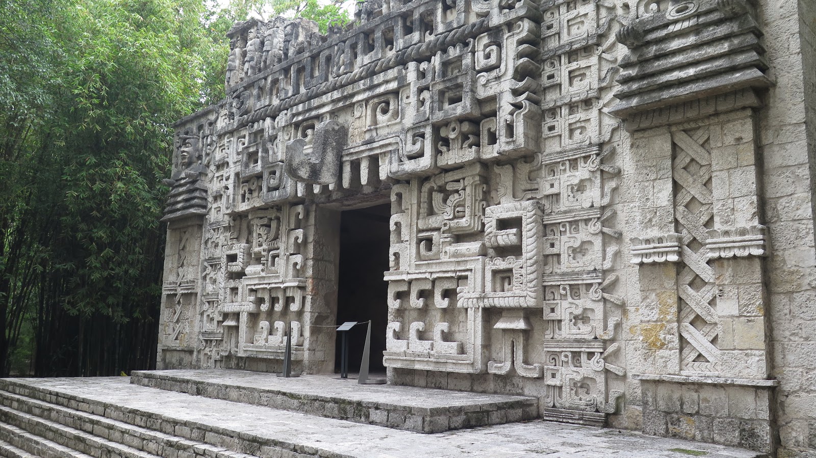
Celebrate CInco de Mayo with some Mexican Landscape Architecture.
I finally made my first trip to Mexico City last year and was amazed.


I finally made my first trip to Mexico City last year and was amazed.




Graceland Cemetery
One day after I mention it in class, the Chicago Tribune exhorts readers to visit Graceland Cemetery. After reminding us that the entire cemetery is an arboreal wonderland sprinkled with amazing architecture, including several Louis Sullivan monuments, the columnist drops an exclamation mark on it with a closing sales pitch for the Burnham burial site.
As powerful as the Sullivan-designed monuments are, my favorite place at Graceland is not a work of architecture, but a piece of environmental design — the island in the lake where the architect and urban planner Daniel Burnham and his family are buried. You reach the island by crossing a narrow wood footbridge. It leads to an irregularly-shaped boulder that marks the resting place of Burnham and his wife Margaret.
A canopy of trees offers a sense of shelter, while the water surrounding the island adds a dose of serenity. The lakefront that Burnham championed as a great public space is closed to the public, but here, at least, the visitor can honor the visionary who did so much to create it.
04 May 2020
Coronavirus by town

Hospitalizations are down and the rate of cases is slowing, but the spatial spread continues. There are not many places left in New Jersey that are free from COVID-19. This map shows the rate, by municipality, by date (Cases/100,000).
If we isolate the 20 largest municipalities (by population), the May 1 reported rates still some variability. I've added population numbers (2010) for quick reference. Please remember that these are being made quickly during the outbreak and not with unlimited time to check and confirm. Hamilton Township is in Mercer County.
May 1 rates and 2010 population data
| Reported Cases/100k | 2010 Population | Population Density | |
| East Orange City | 2277 | 64270 | 16395 |
| Gloucester Twp | 433 | 64634 | 2776 |
| Old Bridge Twp | 1142 | 65375 | 1690 |
| Union City | 4052 | 66455 | 51918 |
| Middletown Twp | 647 | 66522 | 1528 |
| Passaic City | 3238 | 69781 | 21604 |
| Cherry Hill Twp | 626 | 71045 | 2939 |
| Brick Twp | 1081 | 75072 | 2316 |
| Camden City | 1015 | 77344 | 7394 |
| Clifton City | 2568 | 84136 | 7361 |
| Trenton City | 1427 | 84913 | 10317 |
| Hamilton Twp | 928 | 88464 | 2199 |
| Toms River Twp | 1178 | 91239 | 1731 |
| Lakewood Twp | 1830 | 92843 | 3700 |
| Woodbridge Twp | 1438 | 99585 | 4148 |
| Edison Twp | 1290 | 99967 | 3263 |
| Elizabeth City | 3164 | 124969 | 8984 |
| Paterson City | 3416 | 146199 | 16824 |
| Jersey City | 2127 | 247597 | 15611 |
| Newark City | 1958 | 277140 | 10574 |
30 April 2020
Hands-on student learning in food production
Here is a great story about students getting hands-on experience in research and agribusiness here at Rutgers SEBS. It shouldn't be a big surprise. It shouldn't be a surprise, these students are getting help from people with a deep concern for students. It is interesting to read it with an eye to how we sustain these successes during a time of isolation.
NJ Cities with COVD
Going through yesterday's reports on COVID cases (which probably already lag a little), there were 22 cities and towns in New Jersey with over 1,000 cases. Four of those are in Middlesex County alone. For much of our mapping we have focused on rates (cases/100,000), but for these cities, the actual numbers are important. Imagine trying to track that many cases, or even simply trying to contact them. The cases from the 22 municipalities combine to represent 41% of the cases in New Jersey. Of the 565 municipalities in New Jersey, only about a dozen do not report cases. That leaves the potential for about 550 separate places to watch and address coronavirus in NJ.
Newark, Jersey City, Paterson and Elizabeth are the largest municipalities by population, so it is no surprise seeing them in those same spots on the list. But usually I expect to see Edison and Woodbridge next, so it is interesting to see Passaic with the 5th most cases even though it is the 15th largest by population. Here is the list for "on or close to" April 29th.
Newark 5,300
Jersey City 5,144
Paterson 4,751
Elizabeth 3,953
Union City 2,678
Passaic 2,172
North Bergen Township 2,095
Clifton 2,094
West New York 1,668
Lakewood Township 1,668
Perth Amboy 1,614
Plainfield 1,451
East Orange 1,420
Woodbridge Township 1,404
Union Township 1,404
Edison Township 1,252
Hackensack 1,125
Trenton 1,120
New Brunswick 1,113
Irvington Township 1,112
Toms River Township 1,060
Linden 1,046
The number of cases reported is a fairly one-dimensional representation of the situation (add in uncertainty about reporting, testing, etc. and it gets even tougher). But it is worth noting that while none of these appeared to yet be going down, few are growing nearly as rapidly as they were a week ago. Just remember that these numbers are constantly changing and not something easy to double-check.
Newark, Jersey City, Paterson and Elizabeth are the largest municipalities by population, so it is no surprise seeing them in those same spots on the list. But usually I expect to see Edison and Woodbridge next, so it is interesting to see Passaic with the 5th most cases even though it is the 15th largest by population. Here is the list for "on or close to" April 29th.
Newark 5,300
Jersey City 5,144
Paterson 4,751
Elizabeth 3,953
Union City 2,678
Passaic 2,172
North Bergen Township 2,095
Clifton 2,094
West New York 1,668
Lakewood Township 1,668
Perth Amboy 1,614
Plainfield 1,451
East Orange 1,420
Woodbridge Township 1,404
Union Township 1,404
Edison Township 1,252
Hackensack 1,125
Trenton 1,120
New Brunswick 1,113
Irvington Township 1,112
Toms River Township 1,060
Linden 1,046
29 April 2020
Lancet paper on access in Colombian
Excited to share that our research team, led by Dr. Hanna and Dr. Peck, has published Use of the six core surgical indicators from the Lancet Commission on Global Surgery in Colombia: a situational analysis in The Lancet Global Health.

Part of what made this possible was a commitment by Colombia to keep good records across their entire nation. Part what it took was a large team with diverse backgrounds and skills. And part of it was a leadership with a vision sustained over years. There is plenty left to do. Updates and refinements and comparisons with other factors. But this was a huge step and I am proud to have been part of this amazing team.
Working in Colombia has given me a great chance to discover an amazing country. And the diversity of its landscapes produce some pretty amazing challenges to access to emergency surgical care. Mapping those with and without 2-hour access, was only the first of the six indicators, but it helped illustrate how much both the physical and cultural landscapes of Colombia shaped that access.

Part of what made this possible was a commitment by Colombia to keep good records across their entire nation. Part what it took was a large team with diverse backgrounds and skills. And part of it was a leadership with a vision sustained over years. There is plenty left to do. Updates and refinements and comparisons with other factors. But this was a huge step and I am proud to have been part of this amazing team.
28 April 2020
Exploring coronovirus over time
The GeoHealth Lab @ CRSSA has been exploring municipal patterns of COVID-19 in New Jersey. With 565 municipalities, this is a fairly detailed look at the movement of the virus across the landscapes of the Garden State. It is fraught with challenges since not all municipalities are reporting these numbers every day, they may not be using consistent definitions, and the municipalities range wildly in area and population. While we are culling these data from a variety of sources - tweets by mayors, county web sites, various newspapers - the reporters at NJ.com have not only been publishing numbers, but they published a great explanation of why you should be wary of these data. In that spirit, these early data visualizations are offered as a rapid response.
While you should be careful in reading these data, as longitudinal data they display some remarkable patterns. Eventually there will be more carefully checked data that is presented in carefully balanced representations. But as we are currently surrounded by this pandemic, we should see what we can in the moment. As a simple example, we can start just comparing the reported rates (cases per 100,000 residents) for just a few cities:

Early reports asked why New Brunswick (yellow) wasn't experiencing growth as fast as a few other cities, but the graph shows New Brunswick (blue) catching up with Newark's rate in recent days. There is also a spatial pattern implied, as the southern cities lagged - it seems that northern New Jersey started first but Trenton is starting to catch up. Will Atlantic City (light blue at the bottom) see a later jump in its rate? The answer to that will have policy implications for the statewide shutdown.
Having suggested that the pattern is spatial, what we need is a map that shows us the changes over time. Here is an animated GIF tracking the municipal data from March 31 to April 27. (If it isn't animated for you, you can download it or refresh this page.)

The first time through you might just notice that the map gets darker. But with a second run through the animation you might notice that it starts with higher rates in Bergen County and spreads West and South. As it does, you can also see that it moves like a wave, washing across both large and small towns.
To see if large cities were having similar experiences, we selected out the 20 largest municipalities in New Jersey by population. For each of these, we graphed their change in reported rates over time. With so many squiggles it is hard to pick out just one town, but the legend shows their rankings and. more importantly, the graph shows that most of them are experiencing similar trends (consistent growth), but at decidedly different rates. Again, don't get lost in details, since these data could still use some polish. But the big pattern can help identify where to watch in the coming days.


While you should be careful in reading these data, as longitudinal data they display some remarkable patterns. Eventually there will be more carefully checked data that is presented in carefully balanced representations. But as we are currently surrounded by this pandemic, we should see what we can in the moment. As a simple example, we can start just comparing the reported rates (cases per 100,000 residents) for just a few cities:

Early reports asked why New Brunswick (yellow) wasn't experiencing growth as fast as a few other cities, but the graph shows New Brunswick (blue) catching up with Newark's rate in recent days. There is also a spatial pattern implied, as the southern cities lagged - it seems that northern New Jersey started first but Trenton is starting to catch up. Will Atlantic City (light blue at the bottom) see a later jump in its rate? The answer to that will have policy implications for the statewide shutdown.
Having suggested that the pattern is spatial, what we need is a map that shows us the changes over time. Here is an animated GIF tracking the municipal data from March 31 to April 27. (If it isn't animated for you, you can download it or refresh this page.)

The first time through you might just notice that the map gets darker. But with a second run through the animation you might notice that it starts with higher rates in Bergen County and spreads West and South. As it does, you can also see that it moves like a wave, washing across both large and small towns.
To see if large cities were having similar experiences, we selected out the 20 largest municipalities in New Jersey by population. For each of these, we graphed their change in reported rates over time. With so many squiggles it is hard to pick out just one town, but the legend shows their rankings and. more importantly, the graph shows that most of them are experiencing similar trends (consistent growth), but at decidedly different rates. Again, don't get lost in details, since these data could still use some polish. But the big pattern can help identify where to watch in the coming days.

Keep an eye out for updates. There is plenty more in the pipeline.
Subscribe to:
Posts (Atom)


